TEMPO AUTOMATION REBRAND
Accelerating the future of manufacturing
frog helped articulate Tempo’s offering through a new brand identity, website and factory experience.
My role included developing and building the illustration style, iconography, color palette, and UI design.
VISUAL IDENTITY CONCEPT: THE DIGITAL THREAD
Tempo makes it possible for engineers to manufacture circuit boards in as little time as 3 days, from design to desk.
1. BRAND VISUAL ID
Brandmark
The logo identity is an abstract visual representation of the unbroken 'digital thread' that Tempo creates from design to delivery. The asymmetry and color gradient provides a sense of perpetual movement and progress.
Isometric Illustrations
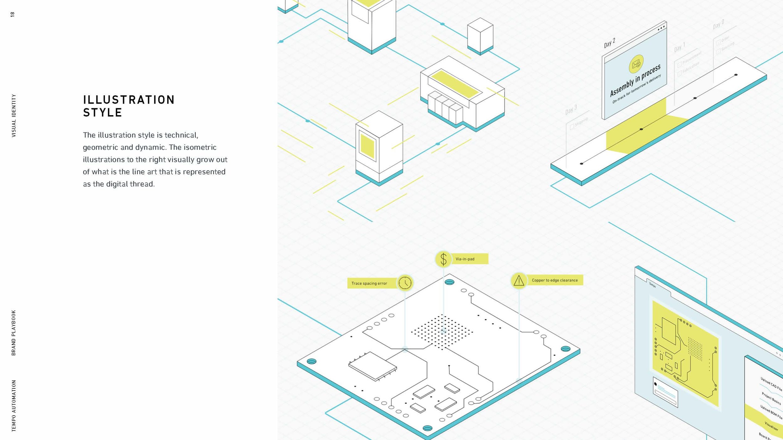
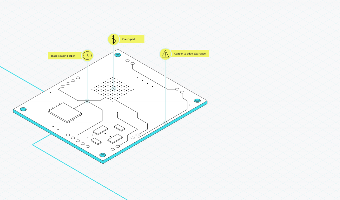
The illustration style is technical, geometric and dynamic. The line illustrations typically grow out of the 'digital thread' represented as a single line in the drawings.
Iconography
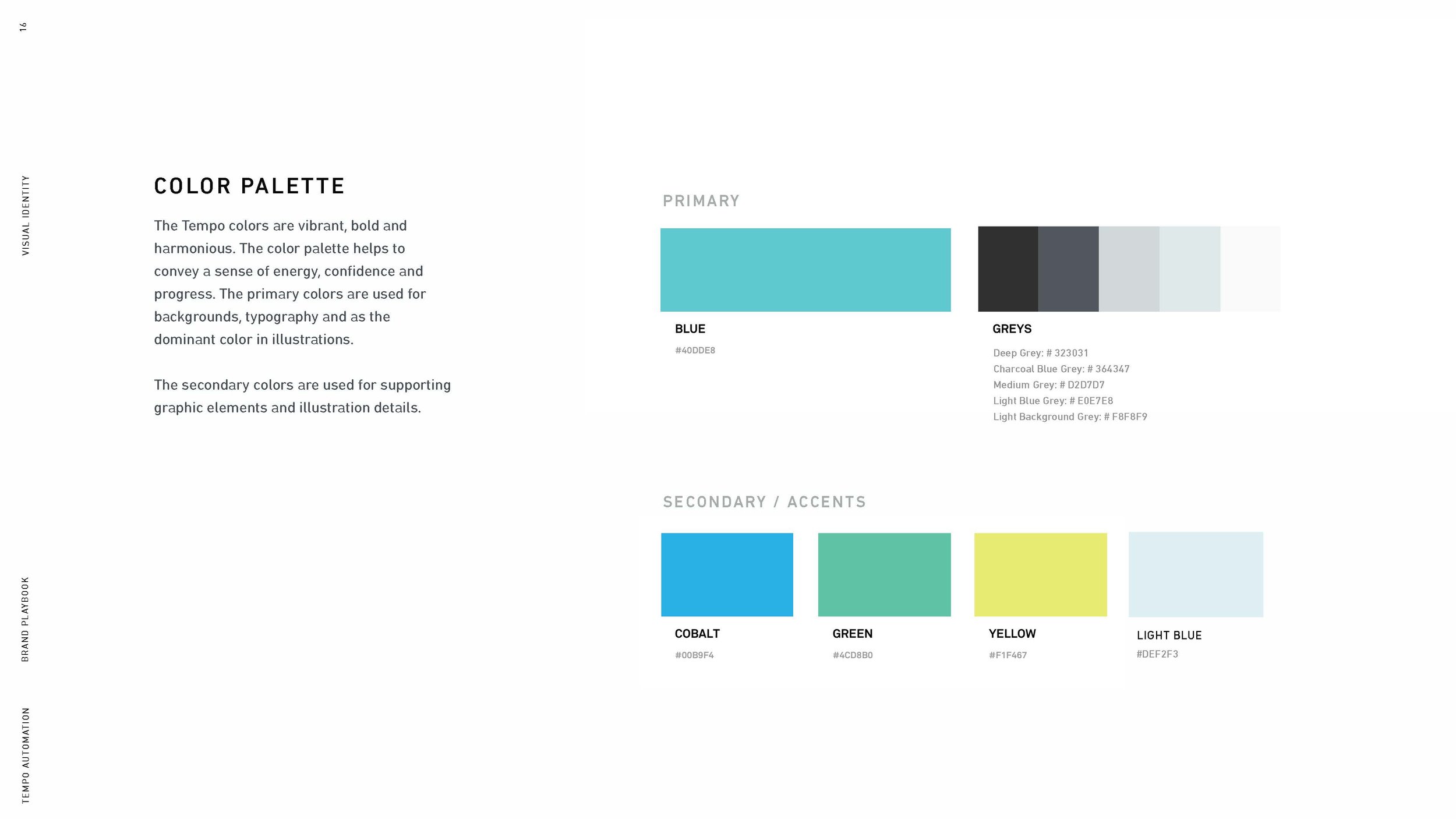
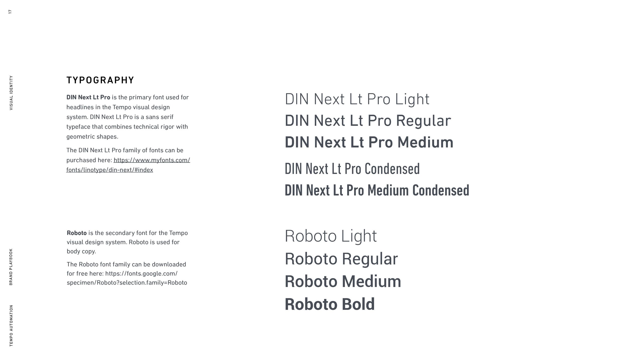
Typography & Color Scheme
2. WEB EXPERIENCE & DESIGN
Tempo makes it possible for engineers to manufacture circuit boards in as little time as 3 days, from design to desk.
> Launch site
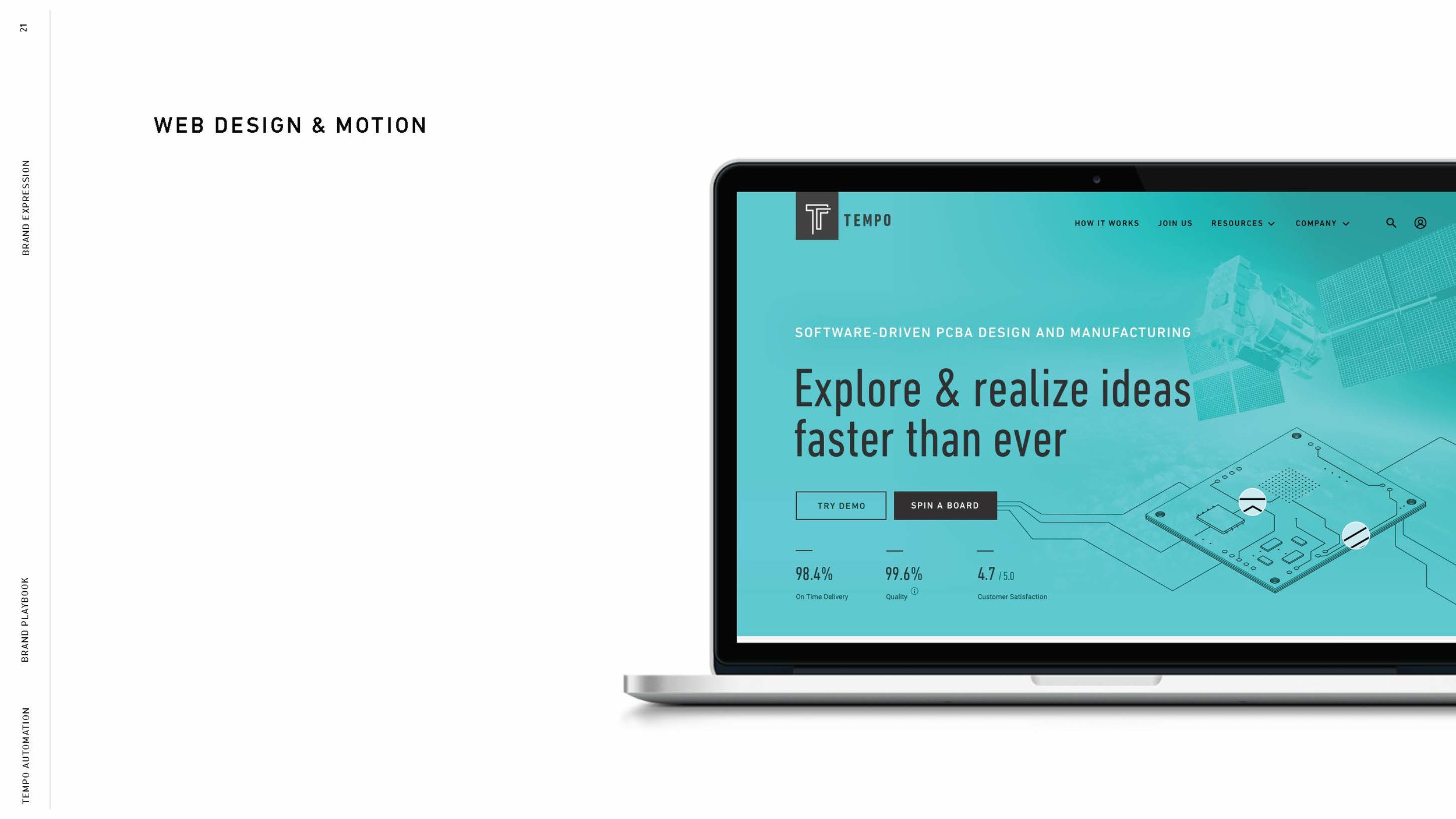
Desktop - UI Design
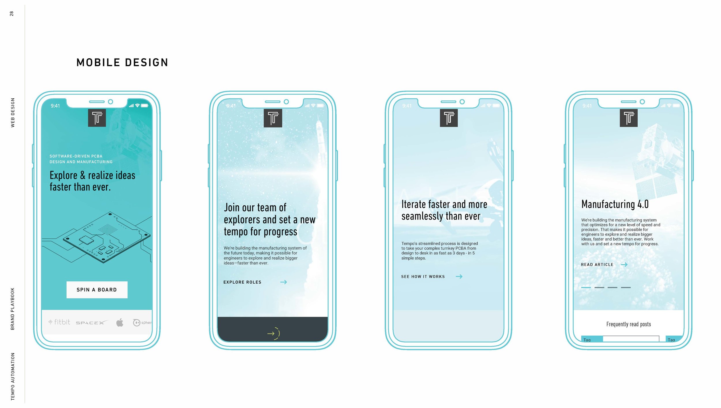
Mobile - UI Design
Home Page - Interaction
The digital thread scrolls through the page, revealing the key features of Tempo's product.
3. FACTORY BRANDING & TOUR DESIGN
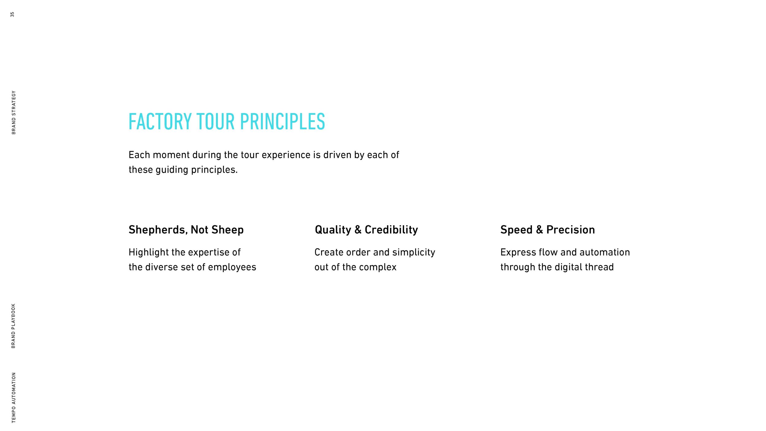
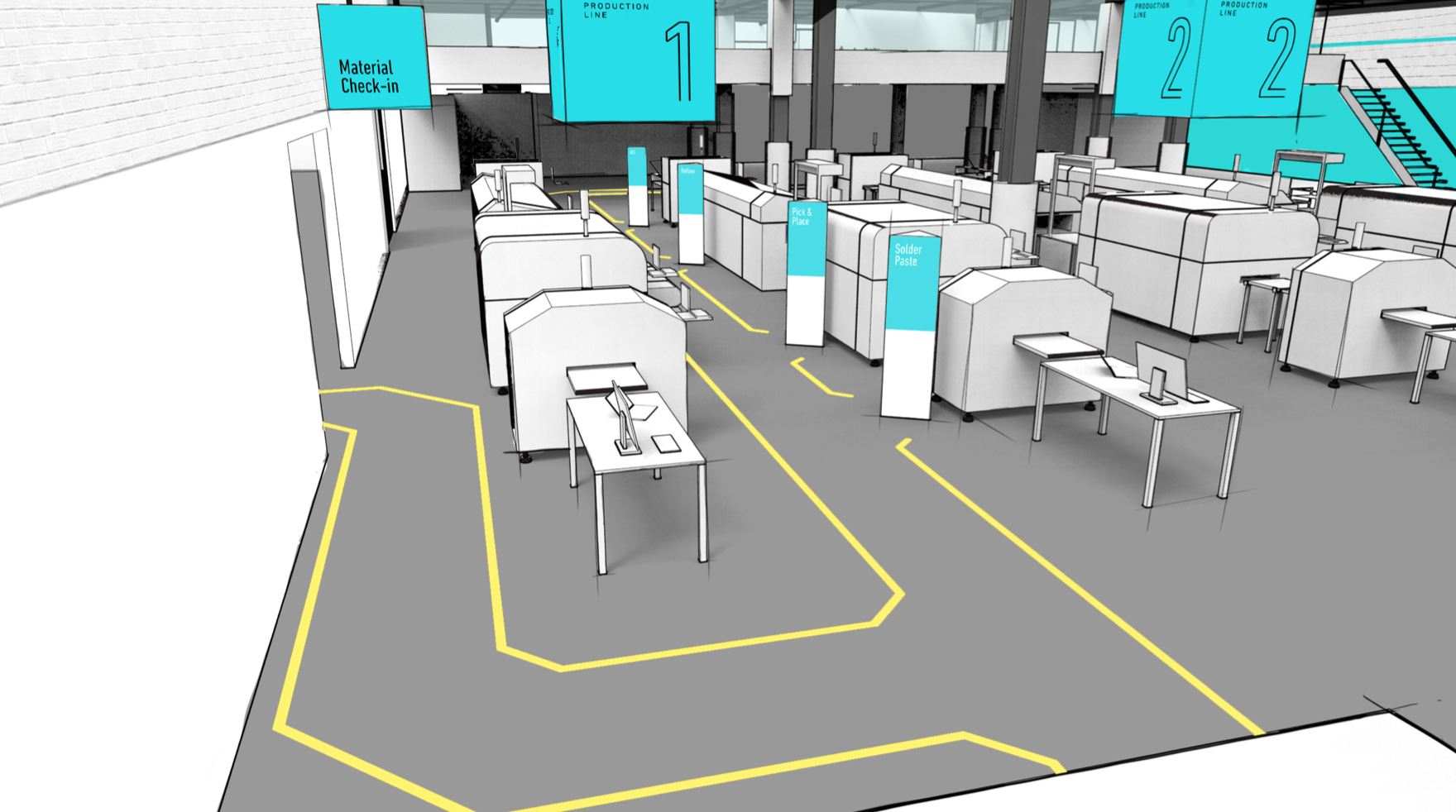
The tour experience consists of 6 key experience moments. The narrative of each key moment flows between wide to narrow in terms of detail and information. The start of the tour is meant to give a high-level overview into Tempo’s offering and as the tour progresses, the level of detail becomes much more granular. As the tour winds down, the narrative widens again to speak more about the vision and trajectory of the business.
Brand moments at the Tempo Factory - Environment Design
Credits
Client TEMPO
Design Studio frog design
Principle Designer TAMMY BAIRD
Industrial Designer ARA ACLE
Product & User Experience ALEC MOMONT
Brand & Visual Designer CELIA JABER

